For the final week of Animation, I decided to go back to my roots: creating colorful, textured 3D scenes. With an extensive background in 3D art, I decided to turn my Cornell Box into a sort of "moving painting". I was heavily inspired by cel-shaded art, as well as anime aesthetic. Here is a shot of my moodboard:
As you can see, I opted for a bright, vivid color palette. I wanted the texture to be soft, yet striking. I usually use Cinema4D to create my 3D designs, so I set about making some assets for my scene.
I already had a tentative setup in mind when I was looking at my moodboard: two figures having a picnic on the clouds. It was both surreal and atmospheric, and I could easily model the assets without getting too complex.
The picnic assets, clouds, and fish were easiest to model, given their simple structure. It was only a matter of utilizing basic cube/spheres, and then adjusting the vertices to create a shape that I liked.
Given my time constraints, it was not feasible to model the human figures. I took some free humanoid models from the Unity Asset store, and added some custom adjustments (hair, sweater, eyes, etc)
Finally, I knew that I needed some 'interest point' that brought the whole scene together, such as a building or animal that the figures would be looking at. Given my cel-shaded style, as well as the color palette of my moodboard, I decided to go with a Japanese temple, given my anime-esque direction. Turbosquid really saved my life with the temple, because I could not have created a temple model in such a short time span.
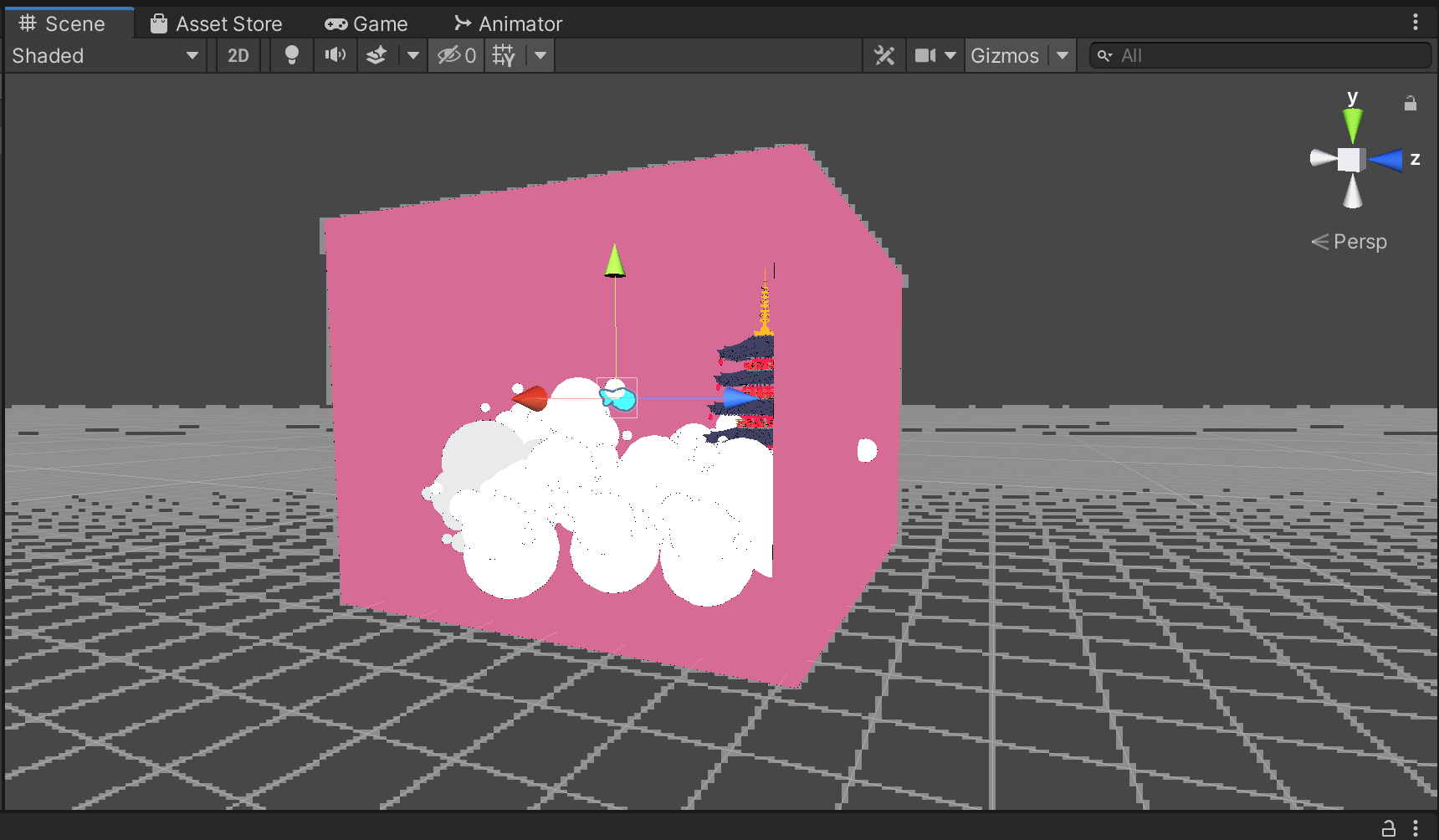
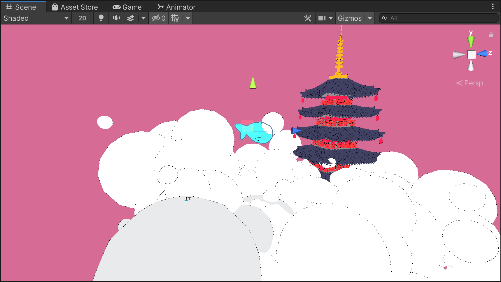
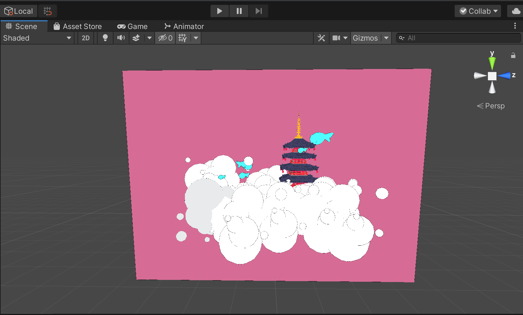
Here are some screenshots of the Cornell Box I created. The unique quality of this environment is the custom shader that I created. As a 3D artist, I was always fascinated with shaders, and during the last year of my undergraduate studies, I created a variation of cel-shading when attempting to generate a cartoon look for one of my projects. The main aspect of my custom shader is that I detect the vertices of the objects in my scene, and 'draw' an outline at the vertices that are defined as 'edges' according to the position of the camera. This way, it looks as if someone has drawn the assets.
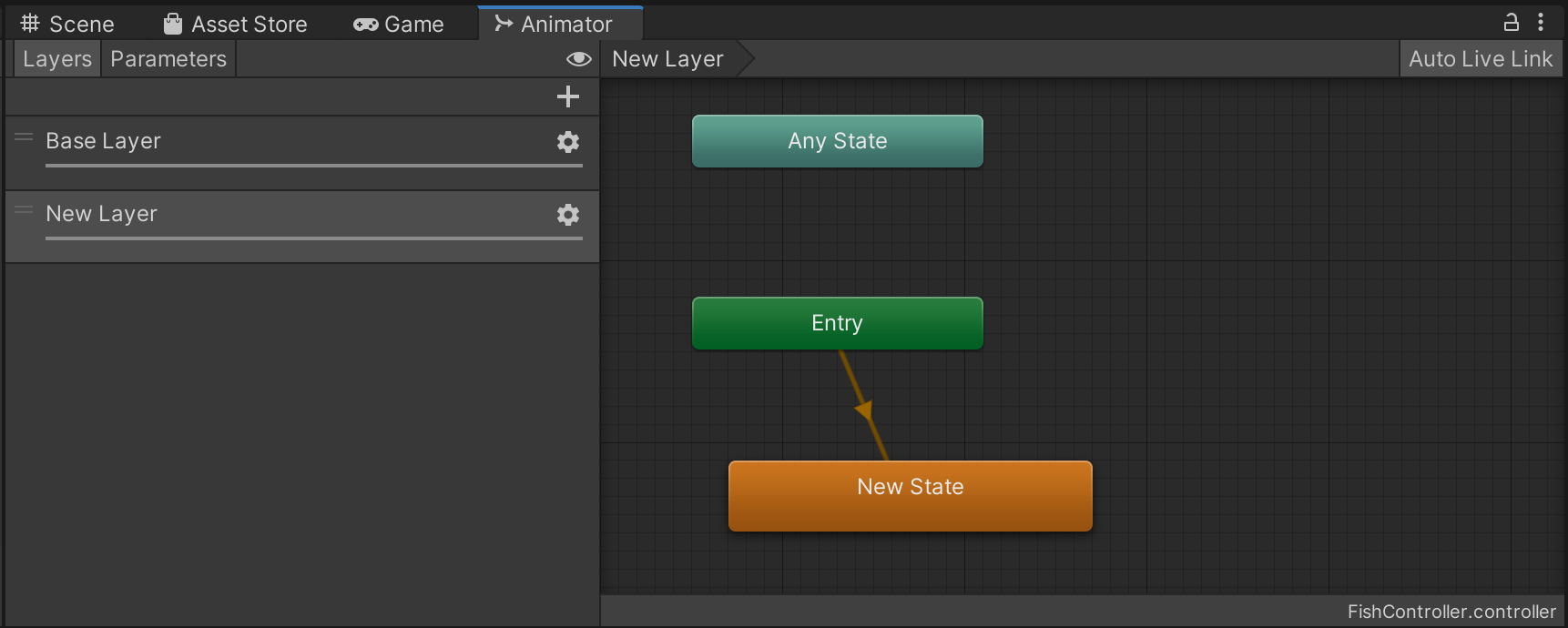
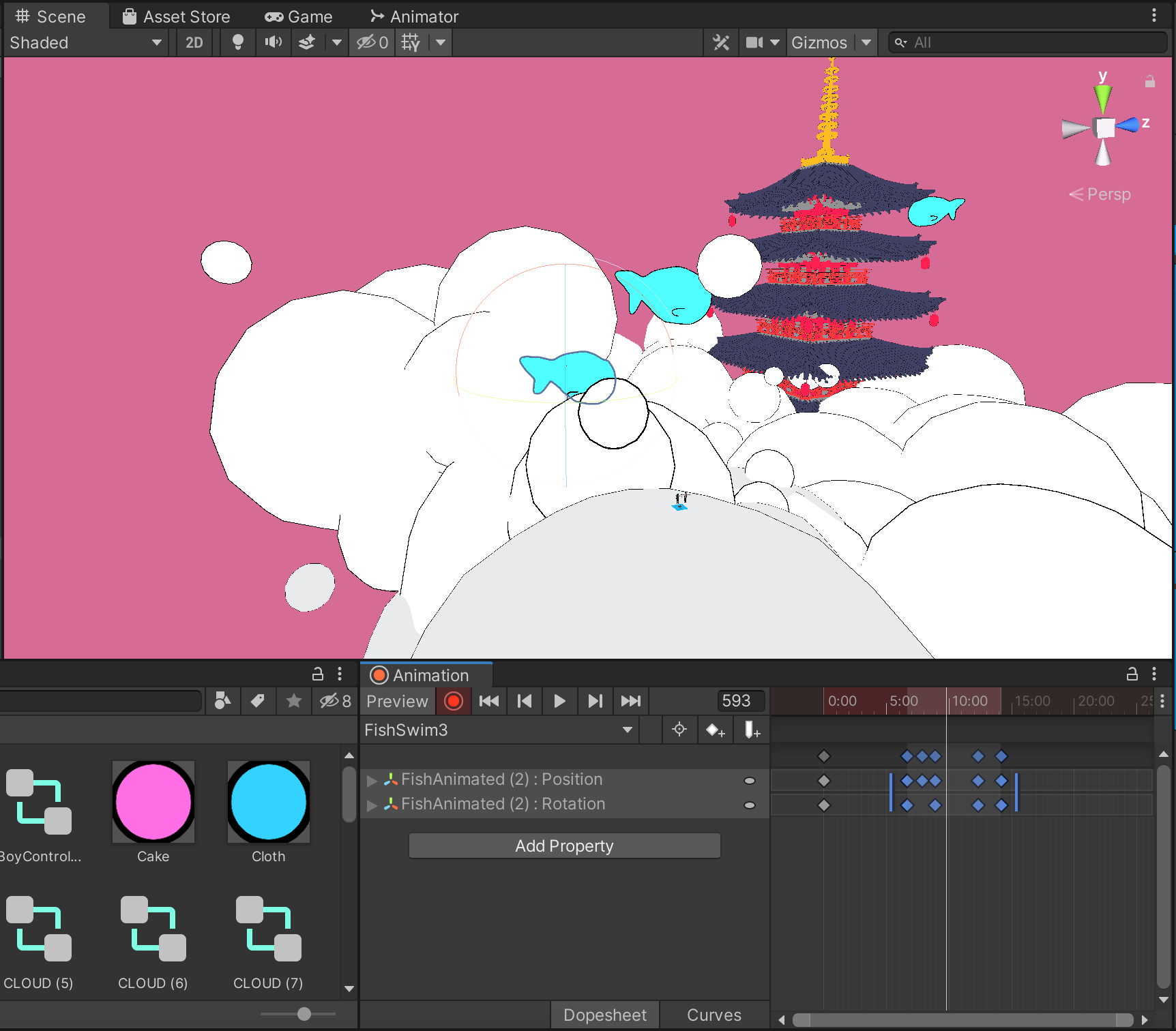
One of the highlights of my daytime scene are the blue fishes that swim in the sky. Animating them was a bit complex to organize at first, but after solidifying the logic, it was only a matter of tweaking the numbers for each fish.
To start off, I made sure to separate the spheres that make up the fish. This way, I could create a short looping animation of the fish moving side to side. While this gives the illusion that the fish is gyrating to push through the 'water' or 'air', the fish is not actually moving in the scene. To do so, I needed to create another animation of the fish changing position and rotation. Because I needed to play two animations at the same time, I layered them in the animator controller and set both weights to "1".
The first daytime scene turned out so well, that I was actually quite surprised with the results. It definitely matched the vibe of my moodboard and felt very calming and atmospheric. The fish movement and scene path felt natural, and the angle of the camera was effective as well. To create more subtle motion, I imported my figures into Mixamo, rigged them, and then applied some simple animations.
Since the scene felt a bit still, even with the moving fish, I wrote a simple function based off of After Effect's 'wiggle', where I randomized the x,y, and z positions of the clouds within a defined constraint. This way, the clouds would 'wiggle' in the scene, and I could adjust their speed and wiggle space accordingly without having to use keyframes.
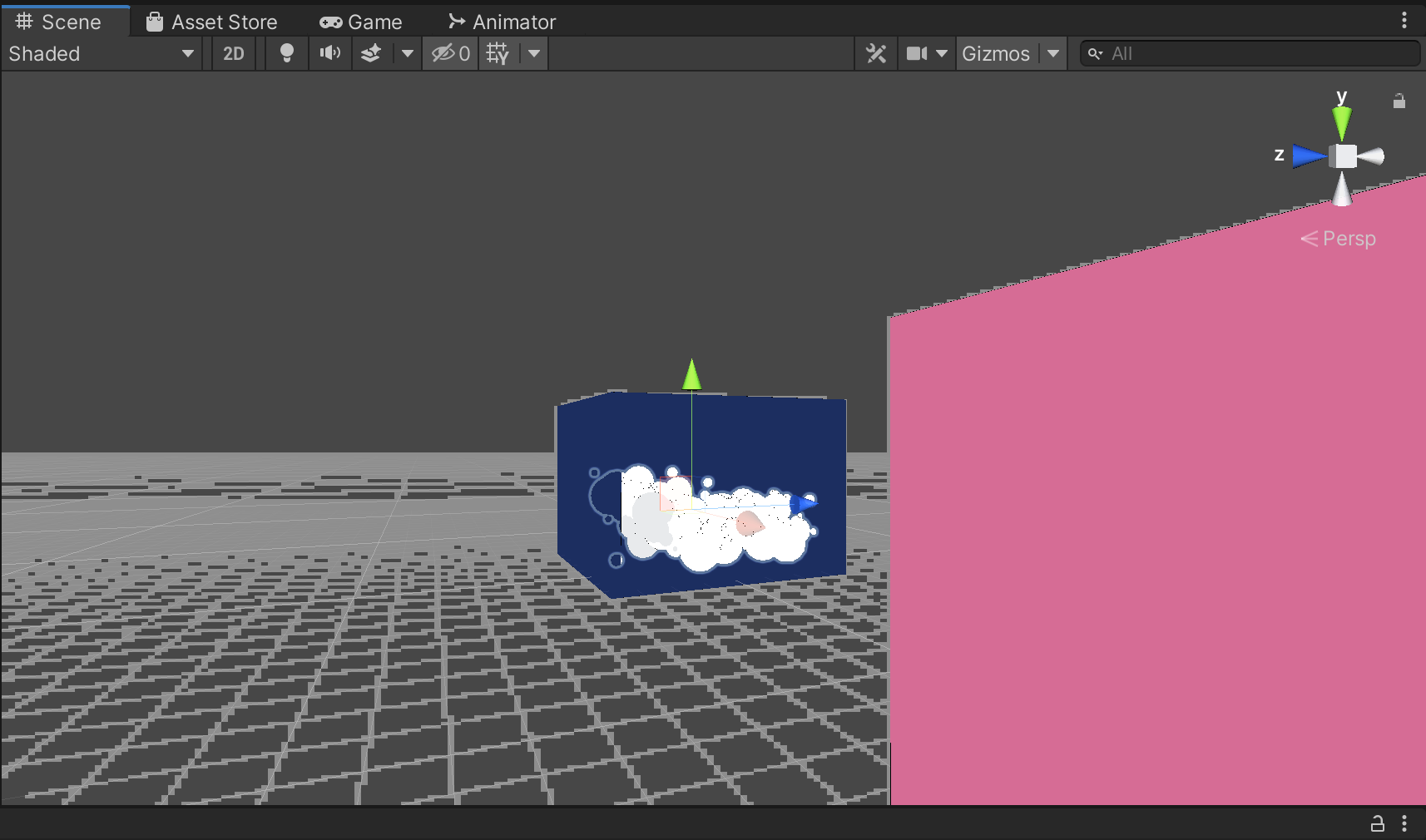
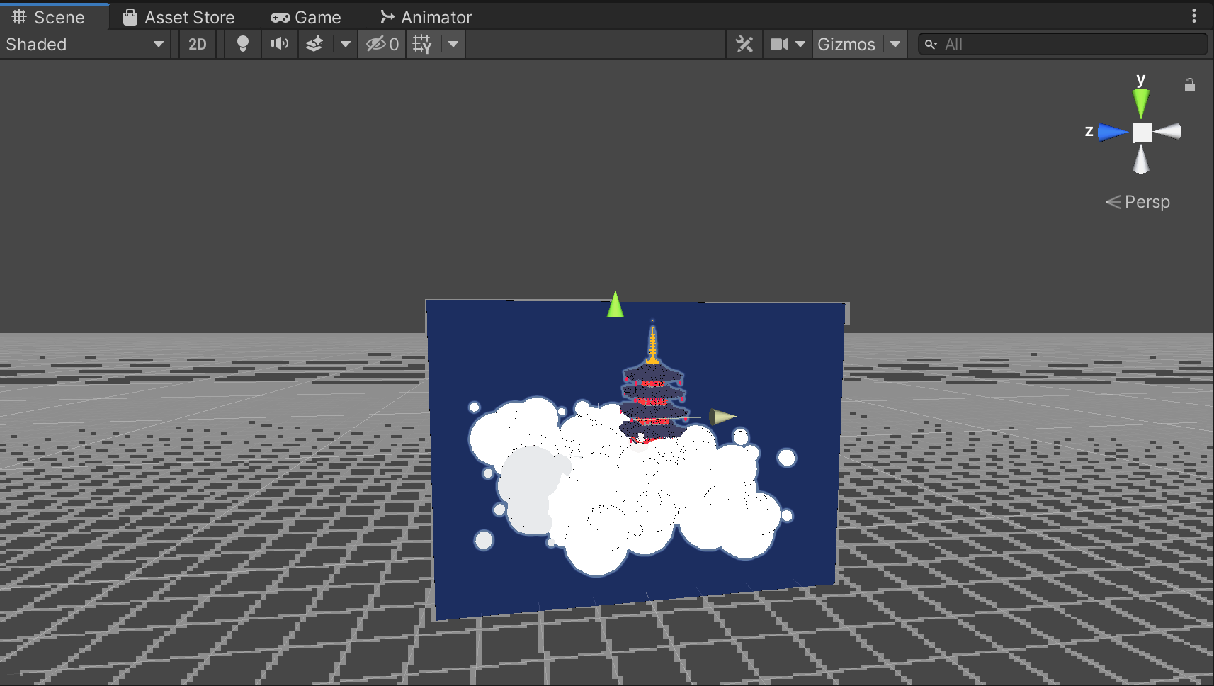
I enjoyed the first scene so much that I decided to make a second Cornell Box to complement it. This time, it would be a nighttime version of the pink box. I simply copy and pasted the first box, changed the color of the box itself, and applied a particle system to create floating stars. I also imported a new set of animations for my figures, and took out the fish.
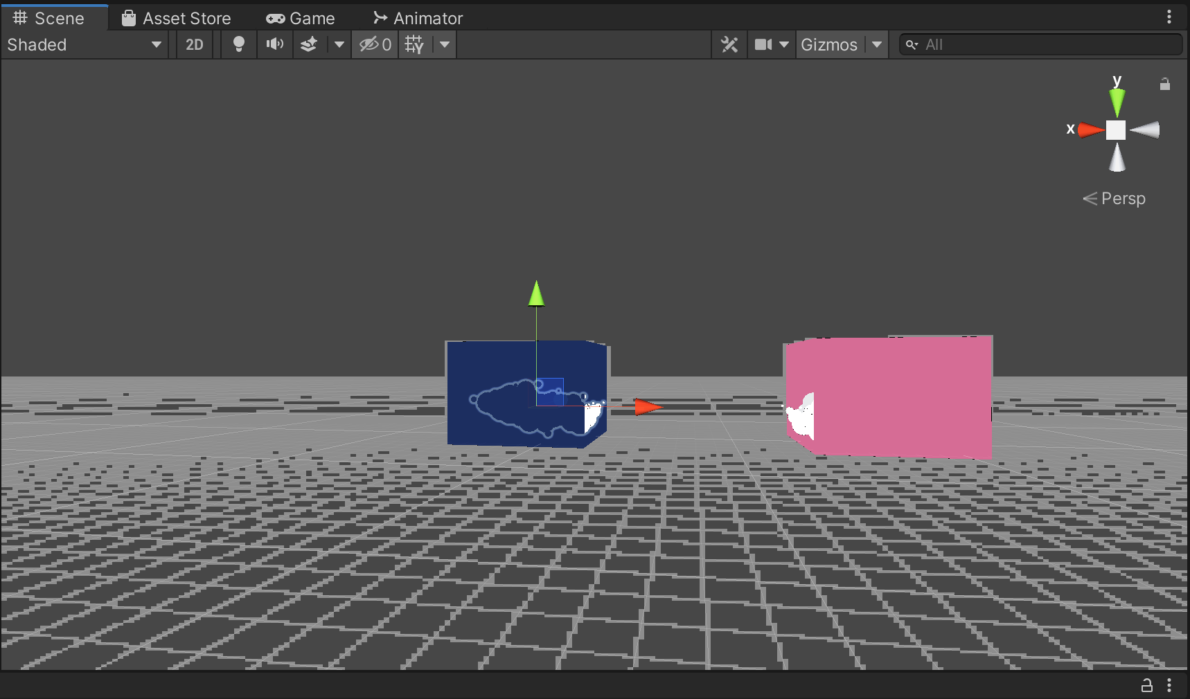
However, once I created my second box, I was faced with a new problem. Originally, I only had one main camera, which was positioned at a specific angle within the daytime scene. Now that I had a second box, I needed a way to switch between the scenes. I designated the 'space bar' as the button to hit to switch between the boxes, but the sudden change in camera felt too abrupt, and kind of destroyed the atmosphere I wanted to convey. As a result, I decided to utilize the 'world space' that contained both my boxes as a mediator between the scenes. I would position a third camera between the two boxes, which would be controlled by the mouse. The player would hit 'space' to transition from the daytime scene to the world space, and then "left command" to transition from the world space to the nighttime scene, and vice versa. This way, the player can move his/her 'head' to face the different boxes, and hit different keys to get a closer look.
As you can see, my method worked out quite well. The x-axis movement and position of the boxes made it seem as if you are in a virtual art exhibition. To further push the aesthetic of 'moving paintings', I set the outline thickness of my shader to 0 for the boxes, so that the edges of the cubes would not be visible. This gives the impression that the boxes are 2D.
Here are some final screenshots:
To top off the surreal, atmospheric feeling I was attempting to achieve, I imported a music track from one of my favorite Soundcloud Artists. The track is "By Your Side" by Sappheiros.
Here is the itch.io link to the experience (fullscreen and audio recommended):
*Itch.io's user interface is a bit clunky to use; make sure to click on the screen once the game loads so that you are able to hear the audio and interact with the mouse