This week, we were tasked with writing a review for Tom Geismar's podcast on visual identity, as well as design a logo for NYU's IMA program.
Geismar's podcast was eye-opening because it provided a lot of insight into the beginnings of abstract logo design, and the step by step process of the ideation and prototyping stage. The podcast centered around the creation of the Chase Bank logo. Personally, I think that the design is effective in that I can immediately pick out a Chase bank on a busy street, and every time I look at an octagon, the image of a Chase ATM pops into my head. It was interesting to hear how Geismar was initially faced with quite a bit of criticism and pushback for going the abstract route with his design, and how higher-ups would state that they "didn't understand" what the logo meant. Yet, after some time, everyone in the office began wearing the octagon logo, and it even began making appearances on workers' cuff links. I think this phenomenon was the result of Geismar's emphasis on simplicity and distinctness; the octagon was easy to memorize, but stands out at the same time because every other logo during that time period were quite complex in composition. The fact that the logo continues to dominate even in today's digital world is a testament to the effectiveness of Geismar's three principles: Appropriate, Distinctive, Flexible.
*On a side note, I was surprised that Geismar mentioned how the Chase logo resembled ancient Chinese coins. Having grown up in China, I've always thought that the octagon was an abstract representation of a coin/money, just because of how similar the two were:
After having listened to the podcast, I began brainstorming for ideas on the IMA logo. I wrote down a few words that I associated the program with:
Tech, Innovation, Physical Computing, Media, Interaction, International, Design, Arts, Electricity, Code, Machine, Mechanical, Prototype, Circuit, Digital, New Media, Invention, Games, Spontaneous, Out of the box, Ideation, Visual
I came up with quite a bit of terms. The ones that are bolded are terms that I thought could be easily depicted on paper (ex: drawing circuit, breadboard, electricity, lightbulb, game controller, etc), while the rest of the terms were more abstract. I began to sketch, keeping the terms in mind
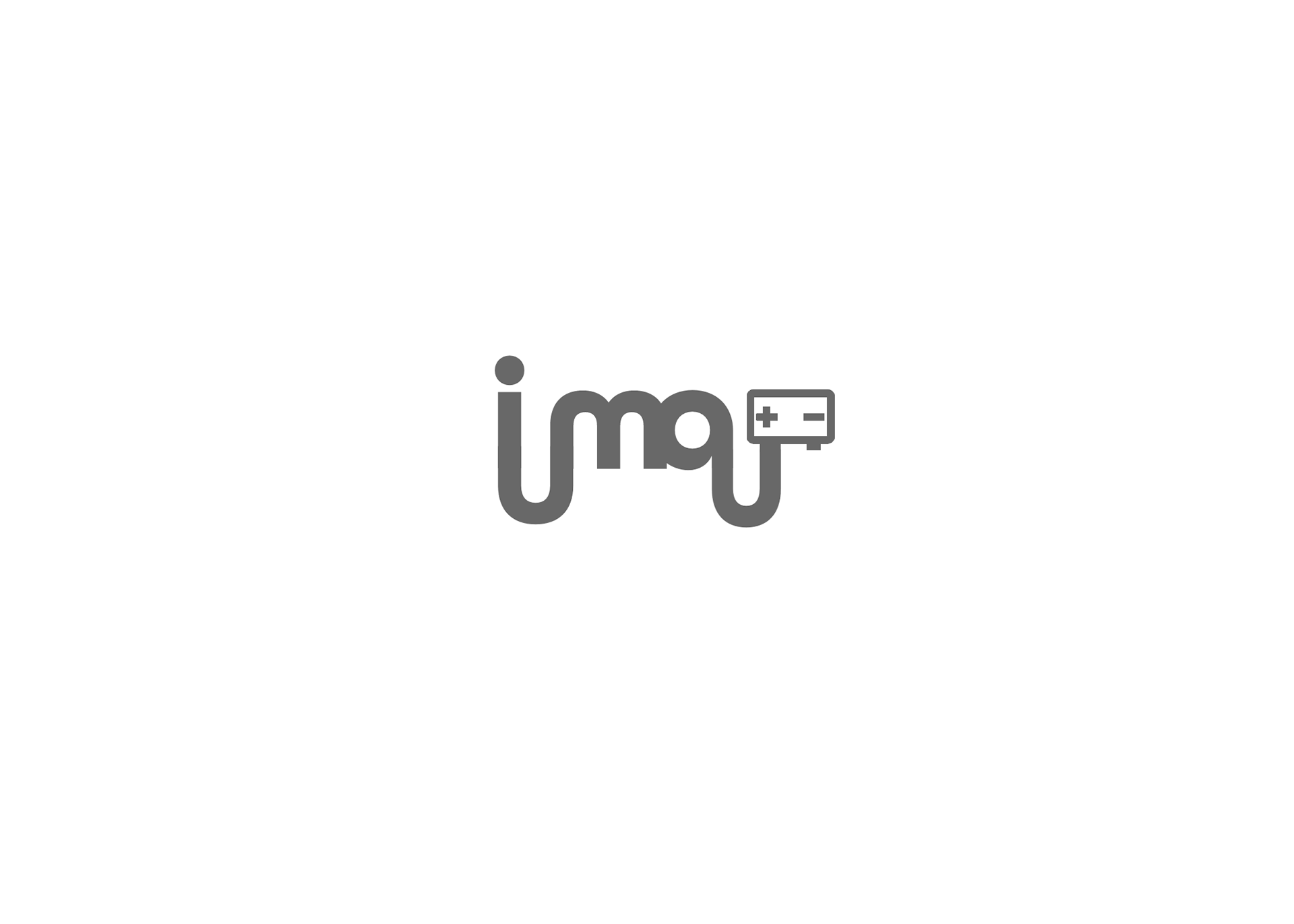
As you can see, I cycled through quite a lot of terms. The first few lines were my attempt at creating "innovation" and "interaction" by integrating the "I" into the "m" or by changing up the axis of the word. I eventually tried to combine the words with a lightbulb to signify innovation and spontaneous idea, but I felt that it was too overused. It wasn't until I moved on to Physical Computing and Circuit that the logo finally took some form. Having seen the typical "circle connected to geometric lines" many times, my natural instinct was to use the dot on the "i" to begin the circuit path, and then connect it with some form of a power source in the end. The words in between would be the path of the circuit. My initial sketches were very promising, so I kept going at it. I thought that since physical computing was such an integral part of the IMA experience, signifying experimentation, tech, and innovation, I would stick with this idea for my logo. I cycled through multiple designs, and decided to draw out the loopy version in illustrator:


I really liked the loopiness of the letters, and I thought it evoked a very techy-digital-gamecube vibe from first glance. I used the All Round Gothic font, and just used to the pencil tool to connect the letters together. The battery pack was created using just simple rectangles.
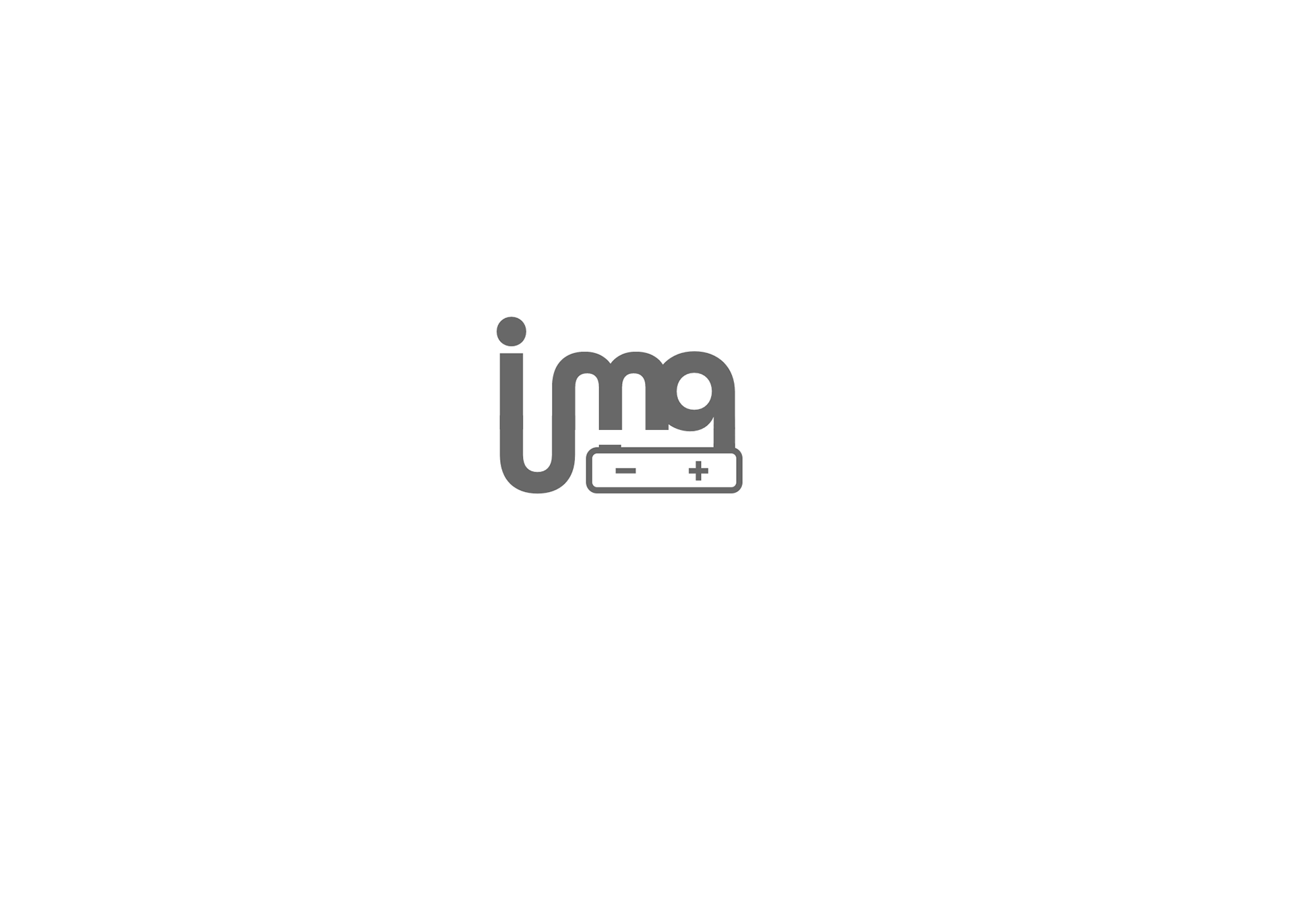
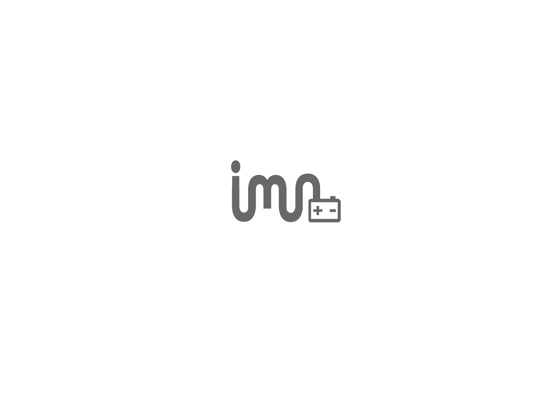
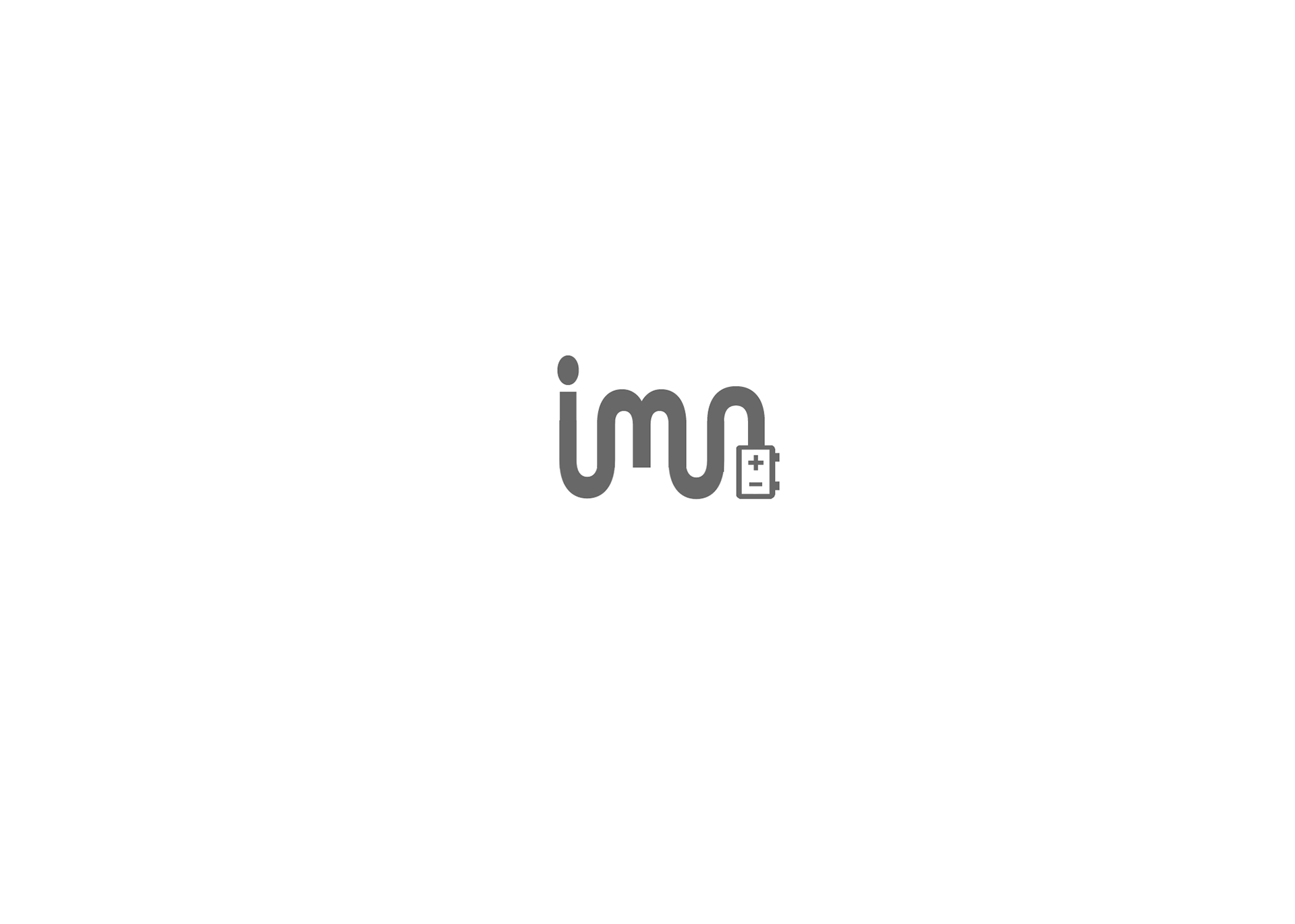
While I liked the direction I was going in, I felt that the first two attempts had one glaring issue: the lowercase "a" at the end looked like a q. I tried to shorten it by cutting the cord loop and putting the battery pack under the word, but it didn't really help. After some sketching, I realized that I could just make the "a" into an uppercase letter, which seemingly solved the problem.
Here is what I originally intended to be my final design:
I still quite like it; however, the issue was that the loopy letters didn't match with the blocky, geometric style of NYU's lettering and logo. I also felt that although the uppercase "A" was a step up from the lowercase "a", it still wasn't as obvious as it could be. Therefore, I decided to redesign the logo by changing the loopy characters into blocky ones. While I was redesigning however, I suddenly noticed that the controller could take the place of the uppercase "A" because the "+" and "-" could be rearranged to act as the holes in the letter.
Here is the final result:
I didn't use any font for this final piece; all letters are made up of simple rectangles. The "-" sign was used as the spacing between the bottom of the "A", while the "+" sign was used as the hole in the middle of the letter. To further push the notion that the "A" was also a battery/power pack, I added some knobs at the ends. I like how the "cord" leads into the "i" at the end as well, and the blockiness of the letters also adds a very pixelated, digital feel as well, pushing the technological aspect of IMA. Looking at the logo as a whole, I wanted to embody these words: tech, digital, physical computing, circuit, games, innovation, media, and I think that the logo does a good job of encapsulating these concepts as a whole.
Looking at the logo with color, it seems to really give off gamer vibes, since the power pack could also be viewed as an 8-bit game controller. It definitely doesn't seem too serious, and actually feels like something you'd see in an indie game or media convention (probably because the colors remind me of Twitch Gaming). Ultimately, I feel quite pleased with how my logo design turned out, and I hope to improve upon my logo design skills even further.